
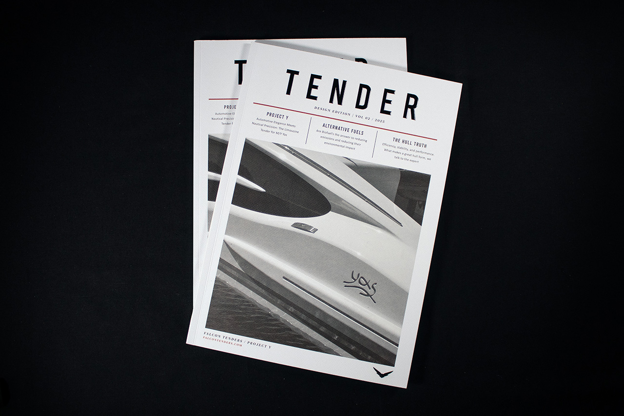
Created for Tender, this publication takes inspiration from editorial newspaper design, combining sharp typography, structured layouts and tactile finishing to create something that feels both contemporary and highly physical in the hand.
The cover immediately sets the tone.
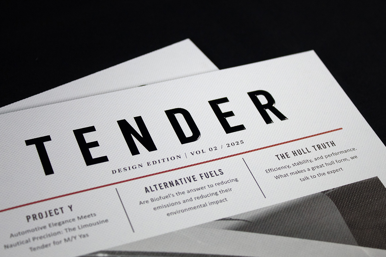
Large gloss black foil typography sits boldly across the embossed Colorplan stock, creating sharp contrast against the textured white surface. As light moves across the foil, the title shifts between reflection and shadow, giving the otherwise restrained layout a stronger sense of depth and presence.
The emboss texture plays an important role throughout.
Rather than using smooth coated covers, the subtle crosshatched surface introduces tactility before the publication is even opened. It softens the overall feel slightly and prevents the black foil from appearing overly polished or aggressive.
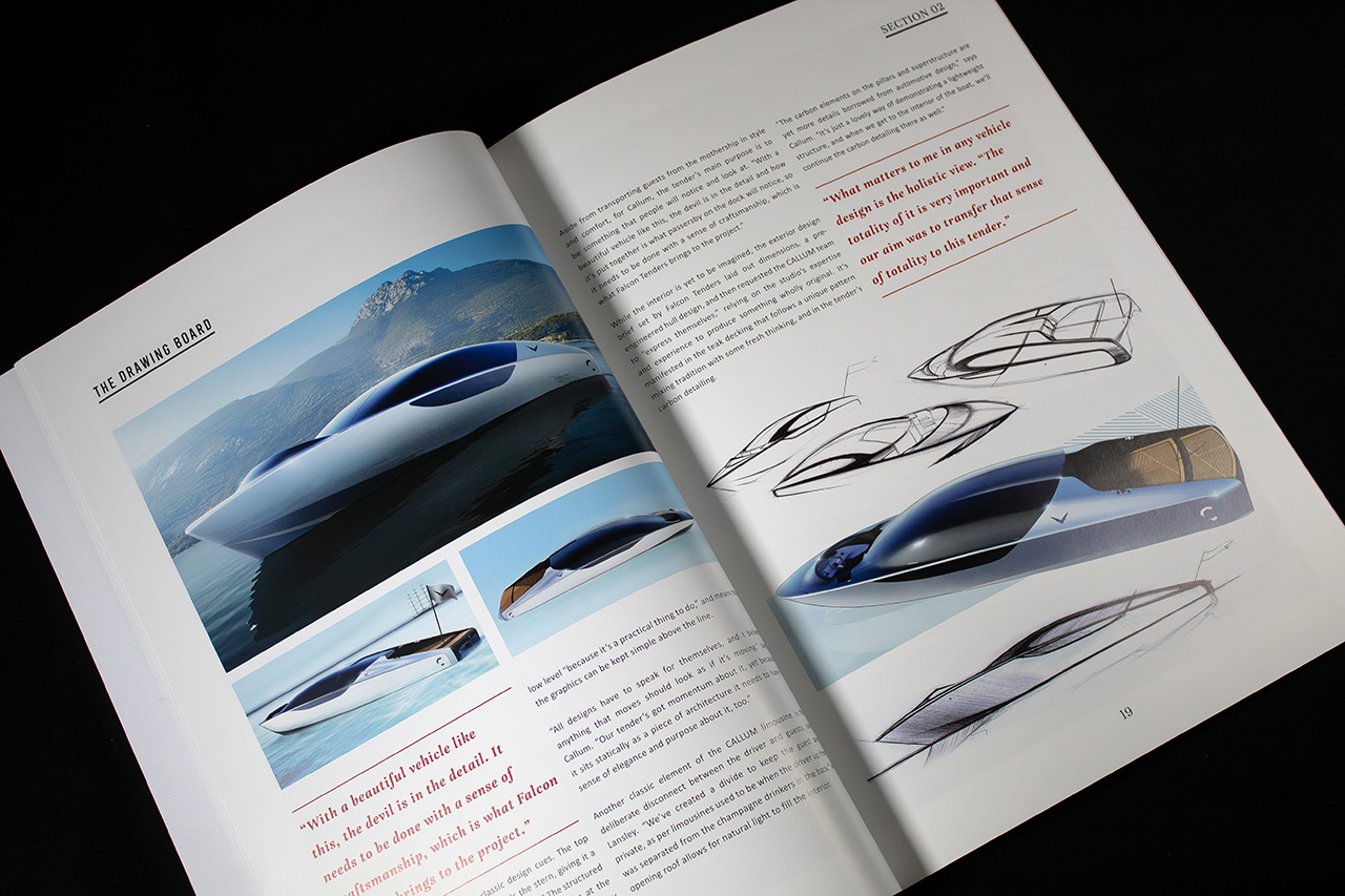
The layout draws heavily from newspaper and editorial design language.
Strong grid structures, oversized headlines and carefully controlled spacing give the piece a confident rhythm, allowing imagery and typography to work together cleanly without visual clutter. The red rule lines introduce subtle hierarchy throughout the spreads, helping guide the reader naturally through the content.
Inside, lithographic print keeps photography and typography consistently sharp across the coated internal stock, ensuring the publication feels refined while still retaining the rawness and clarity associated with print journalism and independent editorial design.
PUR binding gives the piece a cleaner, more durable finish, helping it feel more substantial than a standard magazine while still remaining lightweight and easy to handle.
The result is a publication that feels confident, structured and contemporary, balancing editorial influence with premium production detail in a way that feels deliberate rather than overdesigned.
