
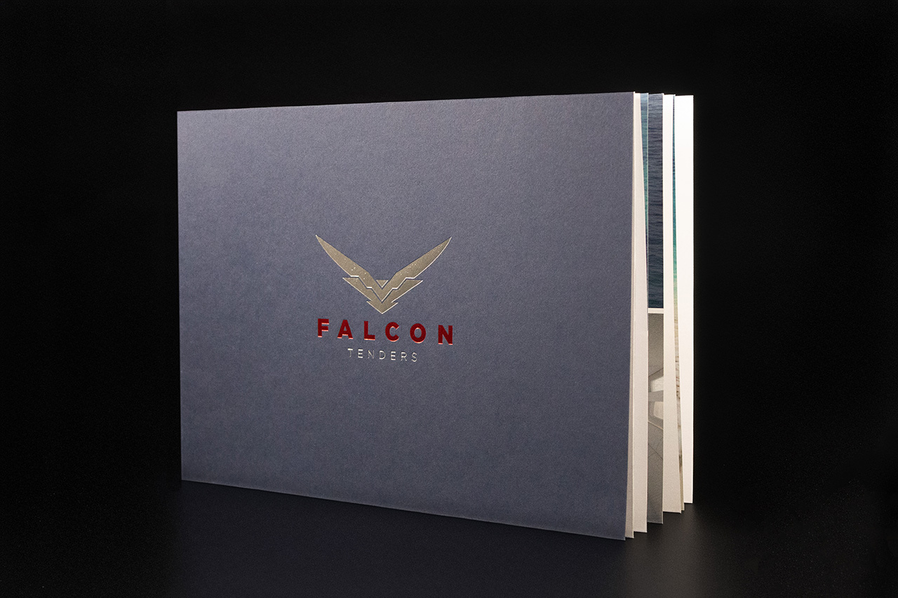
Created for Falcon Tenders, this brochure was designed to feel precise, technical and highly engineered from the very first interaction.
The material choice establishes that immediately.
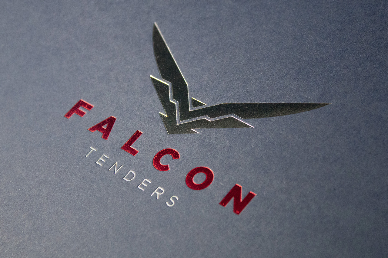
Produced using 350gsm Colorplan Imperial Blue, the cover carries a deep, confident tone with a natural tactile finish that feels substantial in the hand. Rather than relying on heavy graphics or print coverage, the stock itself becomes part of the identity.
The detailing is where the piece really comes to life.
Metallic red foil and gloss silver foil are layered across the cover in separate registered positions, carefully aligned without touching. That level of control matters. It creates movement and contrast as light moves across the surface, while still keeping the overall feel restrained and deliberate.
The red Singer sewn spine reinforces that thinking.
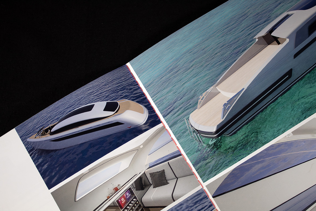
Rather than hiding the construction, the binding becomes a visible design feature. The exposed red thread introduces a subtle engineering reference that feels entirely appropriate for the sector, adding both structure and visual tension against the Imperial Blue cover.
Inside, the brochure remains clean and highly functional.
Full colour lithographic print allows technical imagery, layouts and specifications to reproduce sharply throughout, while Galerie Art Satin gives the pages a smooth, refined finish that balances detail with readability.
Nothing feels excessive.
Every finish, material and construction choice works together to reflect precision, consistency and control, which is exactly what the piece needed to communicate.
