
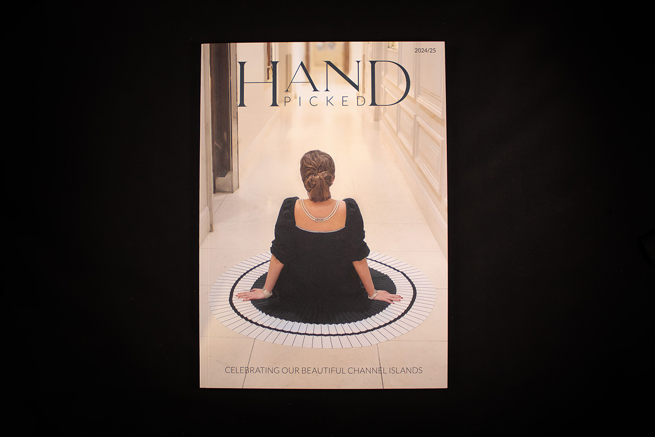
Created for Hand Picked Hotels, this publication was designed to deliver a consistent premium experience across multiple hotel locations and editions, while maintaining the same standard of presentation throughout.
The result feels more like a carefully produced magazine than a traditional brochure.
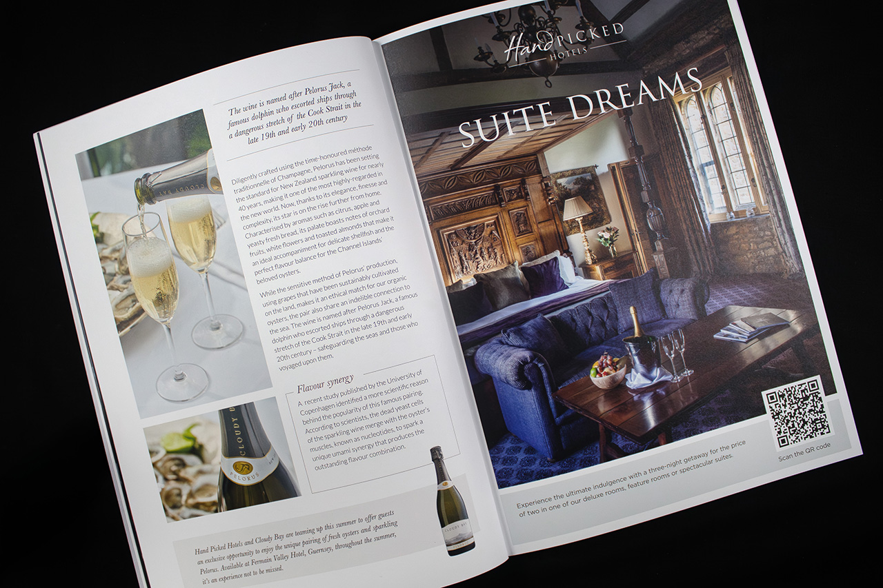
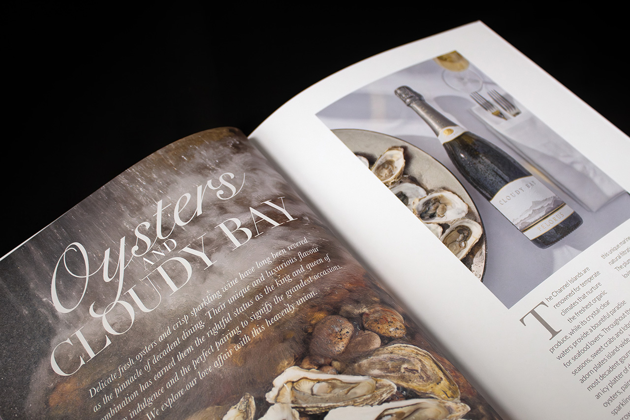
Printed lithographically throughout, the piece uses sharp image reproduction and controlled colour consistency to showcase interiors, hospitality spaces and lifestyle photography with clarity and depth. The heavier cover stock gives the publication a more substantial feel in the hand, helping reinforce the premium positioning of the brand before a page is even turned.
PUR binding was chosen for both durability and refinement.
It allows the pages to open smoothly while maintaining a clean, precise spine finish, particularly important for a publication intended to be handled repeatedly across hotel environments.
What makes the project more complex is the scale of coordination behind it.
Multiple editions needed to remain visually aligned despite variations in imagery, content and hotel specific information. Every version had to feel unmistakably part of the same brand family while still allowing enough flexibility for individual locations and messaging.
The project also extended beyond print production itself.
Fulfilment and coordinated distribution across several Channel Island hotel locations formed part of the overall delivery process, ensuring each edition arrived correctly packed, collated and routed without adding operational pressure for the client.
That combination of production quality and logistical control is what gives the project its strength.
It’s not simply about producing a high end printed piece. It’s about managing the entire experience consistently from press through to final delivery.
