
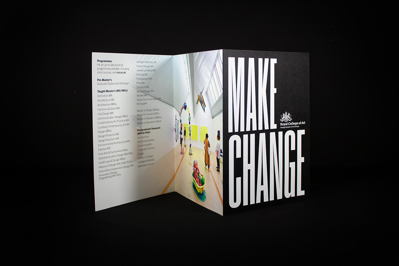
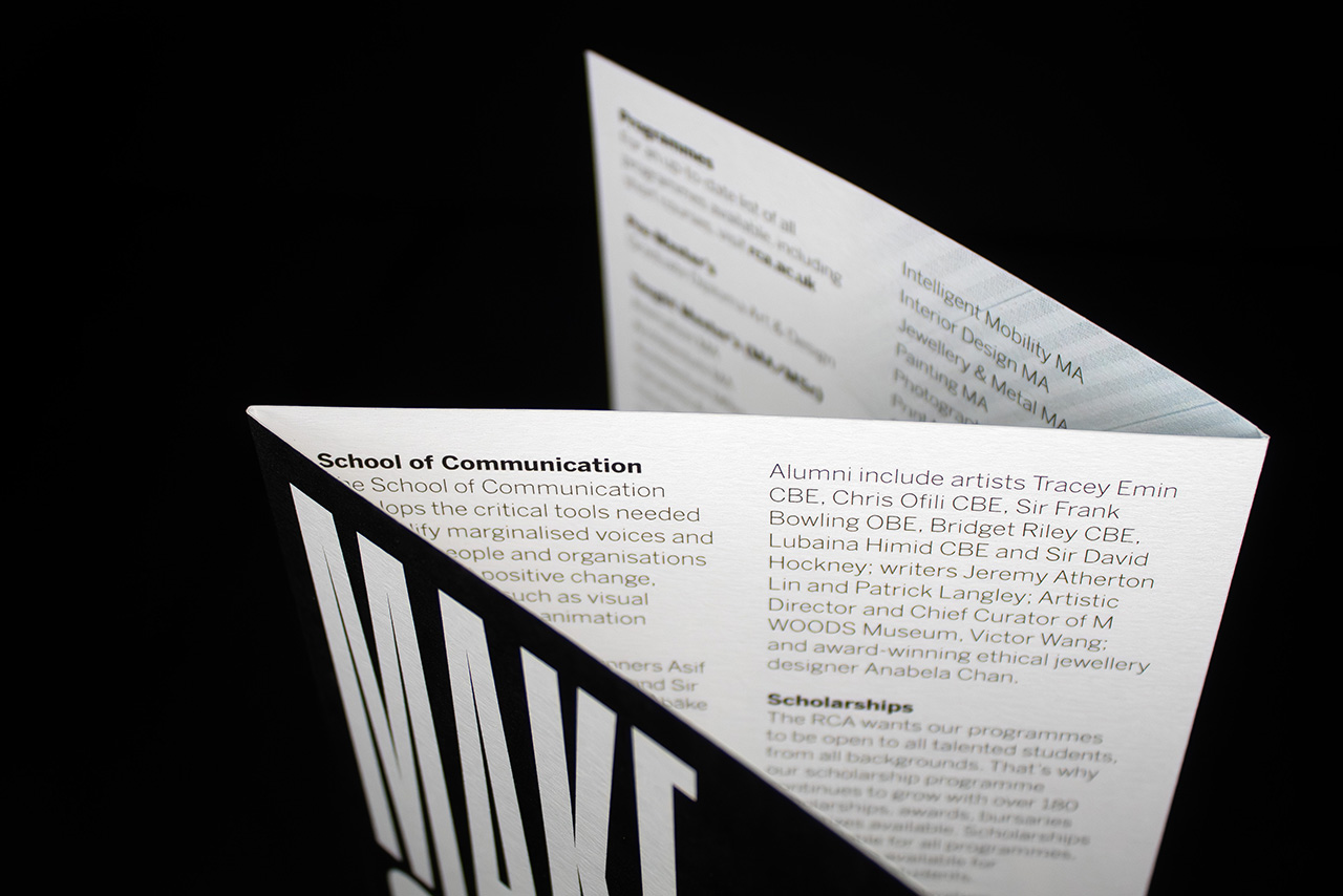
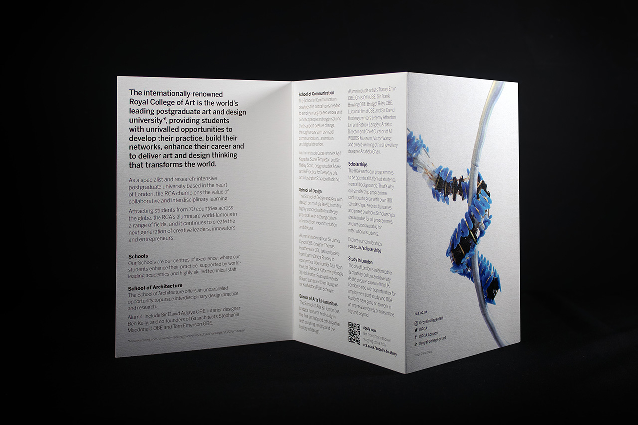
Created for the Royal College of Art, this folded print piece was designed to communicate a large amount of information in a format that feels clear, structured and easy to navigate.
The format itself plays a central role in how the piece works.
Using a six page concertina fold, the content is divided into a sequence of panels that naturally guide the reader through the information. Rather than presenting everything at once, the structure creates pacing, allowing individual sections to breathe while keeping the overall piece compact and manageable.
The cover uses bold typography to establish confidence immediately.
Once opened, the layout becomes more ordered and information led, with each panel designed to carry a distinct purpose. Typography, spacing and image placement all work together to create a clear hierarchy, helping the reader absorb information quickly without the piece feeling dense or overwhelming.
Printed lithographically throughout, the brochure delivers sharp typography and consistent colour reproduction while retaining the tactile quality of an uncoated Colorplan stock.
That material choice is important.
The slightly textured surface gives the piece a more considered and crafted feel compared to a standard coated leaflet, reinforcing the creative and institutional positioning of the Royal College of Art while also making the piece durable enough for repeated handling and distribution.
Despite the amount of information included, the finished piece never feels cluttered.
The pacing is controlled, the structure is intentional and the folding format turns what could have been a conventional brochure into something far more engaging to interact with.
Because when information matters, presentation matters just as much.
