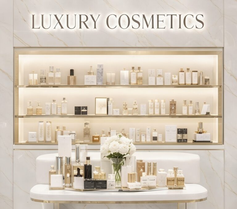
One of the most common mistakes in premium print is assuming that adding more automatically creates more value.
- More foil.
- More finishes.
- More effects.
- More visual noise.
In reality, overdesigned print often has the opposite effect. Instead of feeling premium, it starts to feel uncertain. Too many competing ideas can make a piece feel like it’s trying too hard to impress, which is usually the first thing luxury brands try to avoid.
That’s because expensive brands rarely rely on excess. They rely on confidence.
When Finishes Start Fighting Each Other
Most print finishes look good in isolation.
- Foiling looks impressive.
- Embossing adds depth.
- Spot UV catches light.
- Textured stocks add tactility.
The problem starts when everything appears at once.
Instead of creating hierarchy, the finishes begin competing for attention. Nothing stands out because every detail is demanding to be noticed at the same time. The piece becomes visually loud, and loud rarely feels premium.
The strongest luxury print tends to focus on one dominant idea and execute it exceptionally well. That might be a beautifully subtle emboss on heavyweight stock or a single foil detail used with restraint. The impact comes from control rather than quantity.
Luxury Brands Understand Editing
One of the biggest differences between average branding and premium branding is editing.
Luxury brands remove aggressively. They simplify layouts, reduce messaging and strip back unnecessary detail until only the strongest elements remain. That’s why many high-end print pieces feel calmer and more balanced than lower-end alternatives.
Space plays a huge role in this.
Crowded layouts filled with badges, logos, claims and competing messages often reduce perceived value because the piece feels desperate to communicate everything at once. Premium print usually feels more selective. It trusts the audience to absorb less information more carefully.
That confidence changes perception immediately.
Expensive Doesn’t Always Look Expensive
Some of the most expensive print pieces are surprisingly understated.
They don’t necessarily use every available finishing technique or rely on dramatic visuals. Instead, they feel considered. The proportions are balanced. The typography feels controlled. The materials feel intentional. Everything works together without needing to announce itself loudly.
That’s often what people misunderstand about luxury.
Premium design isn’t normally about showing how much production has gone into something. It’s about making difficult decisions look effortless. Knowing what not to add is usually more important than finding another effect to include.
Why Simplicity Is Harder
Simple print is actually far less forgiving.
When there are fewer distractions, every detail becomes more noticeable. Alignment has to be precise. Typography has to feel balanced. Materials need to carry more of the experience because there’s nowhere for weak decisions to hide.
That’s why minimal luxury print often requires more discipline than heavily decorated work.
Anyone can keep adding finishes. Restraint requires judgement.
What People Actually Remember
Interestingly, people rarely remember print because it had the most effects.
They remember how it made them feel.
- A beautifully weighted invitation.
- A rigid box that opened perfectly.
- A subtle detail they only noticed on second glance.
Those moments create stronger emotional reactions because they feel deliberate rather than overproduced.
That’s usually the difference between premium print and print pretending to be premium.
One relies on noise.
The other relies on confidence.