
Created for Rhino, this brochure range was designed to maintain consistency across multiple versions without losing individuality.
That balance is harder than it looks.
Once variations are introduced, whether through location, department or audience, projects can quickly start to feel disconnected. Different colours, different finishes and different materials often end up competing rather than working together.
This approach keeps everything aligned.
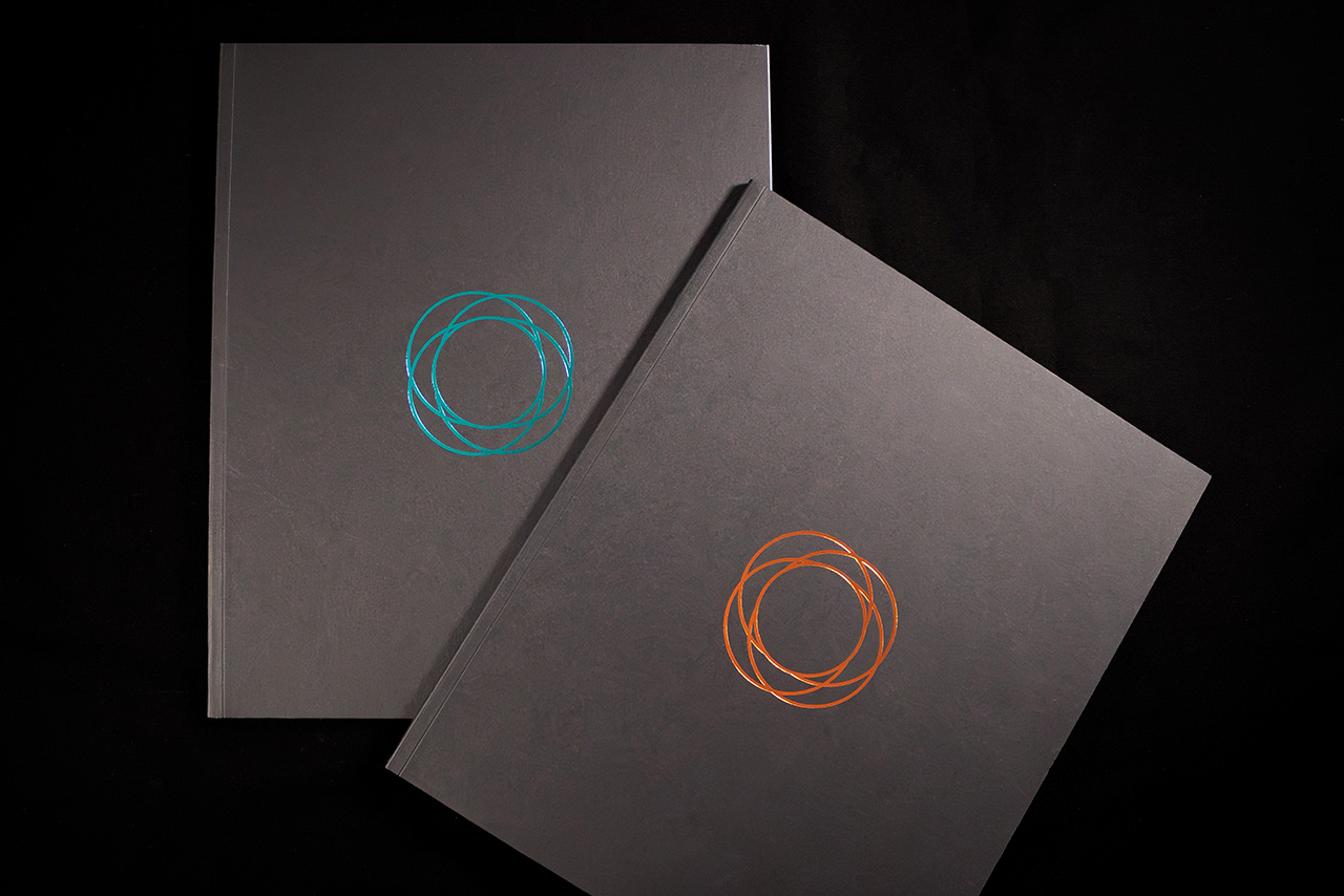
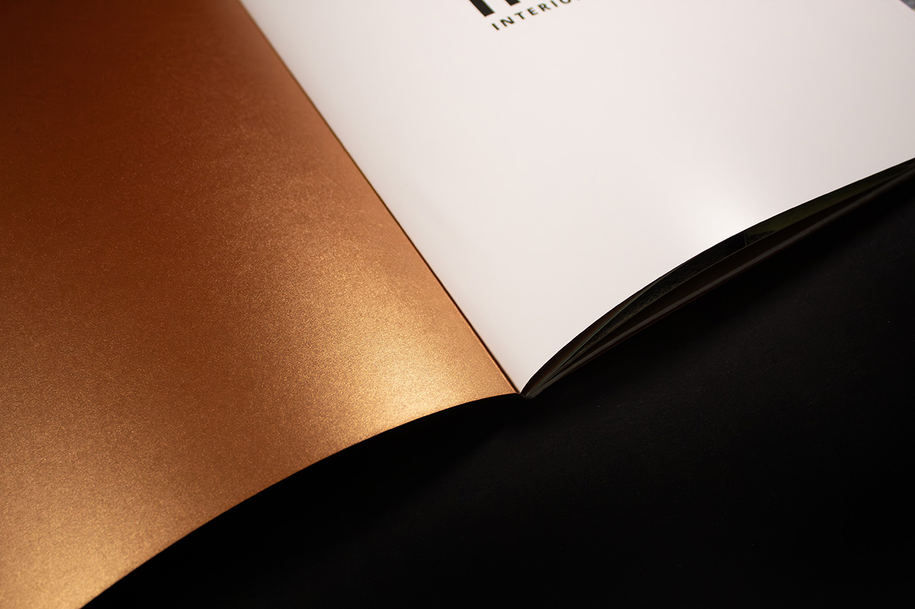
Both versions share the same structure, layout and format, but the cover materials and foil colours create distinction in a more controlled way. One version combines Colorplan Ebony with Majestic Casino Gold, while the other pairs Ebony with Colorplan Marrs Green. The result is two clearly different pieces that still feel part of the same family.
The construction plays a big part in that.
The covers are bonded together to create a substantial 560gsm finish, giving the brochure more rigidity and presence in the hand. It immediately feels more considered than a standard single sheet cover.
Foil detailing adds the contrast.
Copper and blue foil variants are applied directly onto the Ebony stock, creating sharp metallic highlights against the dark surface. Because the foil is used selectively in just a few positions, it feels precise rather than overworked.
Inside, the structure remains disciplined.
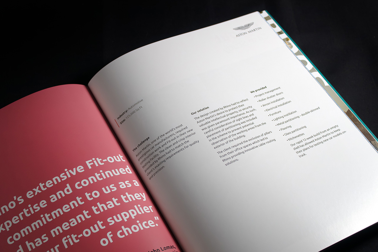
The typography, grid and pacing stay consistent throughout both versions, allowing the colour changes to become the point of difference rather than redesigning the entire piece.
Thread sewn binding reinforces the premium feel further.
It improves durability, allows the pages to sit flatter when opened and gives the finished brochure a more refined, crafted feel in hand.
The result is a multi version brochure set that feels coordinated, controlled and intentionally designed as a complete system rather than separate pieces forced together.
