
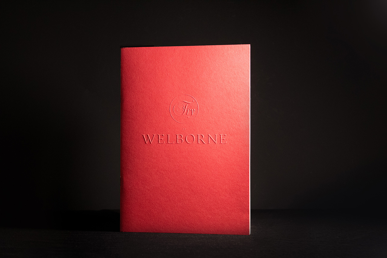

Created for CG Fry at Welborne, this piece was designed to set the tone before a word is read.
The Embossed Colorplan cover introduces a quiet confidence, subtle to the eye, but unmistakable in the hand. It immediately signals care, quality and attention to detail.
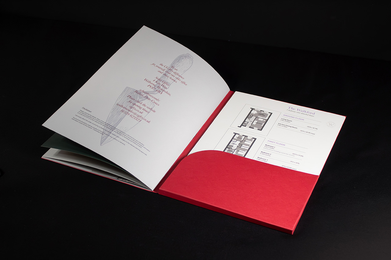
Inside, a stitched brochure and structured pocket folder work together to create a sense of weight and order. Plans, details and supporting materials are presented in a way that feels deliberate, easy to navigate, and reassuringly substantial.
The combination of recycled stocks and precise finishing gives the piece a balance of texture and refinement. Nothing feels overworked or decorative. Every element contributes to a cohesive, tactile experience that invites interaction and holds attention.
In a sales environment, these moments matter. What a prospective buyer picks up begins to shape how they perceive the homes, the development and the brand behind it.
When it feels right in the hand, everything else follows.
