
Created for Arts University Bournemouth, this publication was designed to feel expressive, tactile and creatively unpolished in exactly the right way.
Rather than relying on heavily coated finishes or traditional premium materials, the project embraces rawness and texture to reflect the experimental nature of the work featured inside.
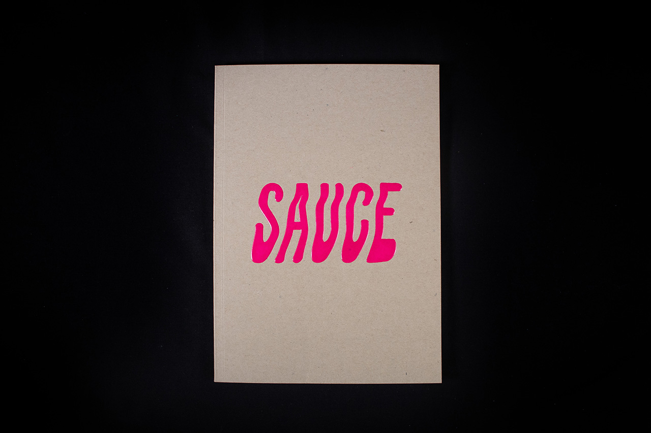
The cover immediately sets that tone.
A duplexed naked board construction gives the publication real substance in the hand, while still retaining the honesty and warmth of an uncoated material. The subtle checker style surface print adds another layer of texture visually, helping the cover feel crafted rather than overly refined.
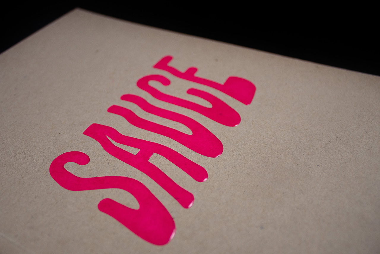
At the centre of the cover, the fluorescent pink “SAUCE” foil emboss becomes the defining feature of the piece.
The combination of vivid foil and embossed depth creates a finish that feels bold, tactile and highly physical against the raw board beneath it. As light catches the foil, the typography shifts in appearance, giving the otherwise restrained cover a strong sense of movement and energy.
That contrast is intentional.
The raw natural stock keeps the publication grounded and understated, while the foil emboss introduces a sharper contemporary edge that reflects the creativity and individuality of the work featured inside.
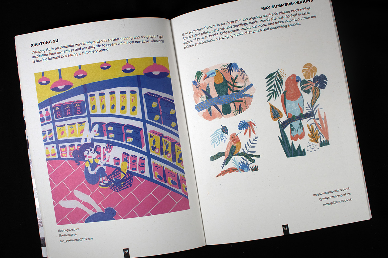
Internally, the publication shifts focus entirely onto the content itself.
The layout allows illustration, colour and experimentation to dominate the spreads, creating an intentionally gallery-like feel throughout the book. Large image placement, generous white space and minimal interference from the page structure allow the featured artists and contributors to take centre stage.
Projects like this demonstrate how material choice and finishing can completely change the personality of a publication.
The result feels less like a standard printed booklet and more like an independently produced creative object designed to be kept, revisited and experienced physically.
