
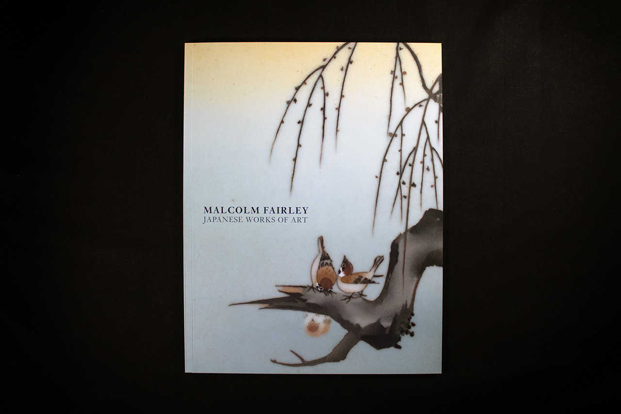
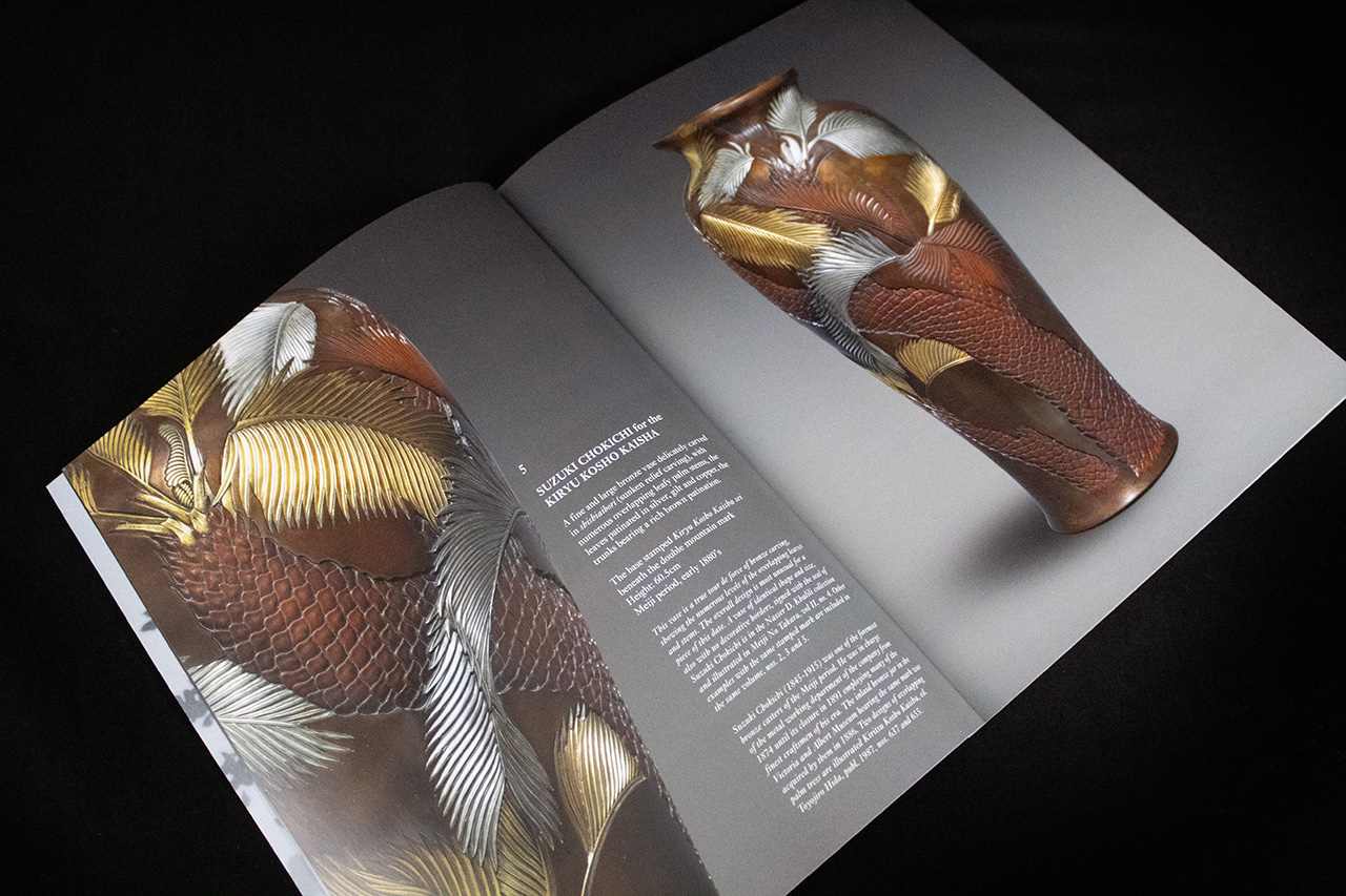
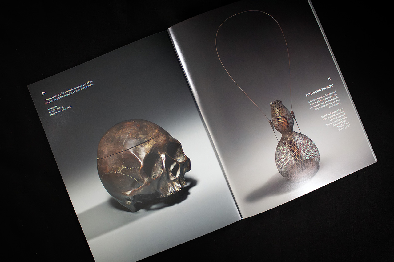
Created for Malcolm Fairley’s Japanese Works of Art catalogue, this piece was designed around faithful reproduction and quiet presentation.
When the subject matter is this detailed and culturally refined, the production has to stay controlled. The print can’t overpower the artwork, but it also can’t fall short technically. Every image needs to hold depth, texture and tonal subtlety consistently across the entire publication.
That’s where UV lithographic printing becomes critical.
Using MAGNO Satin throughout allows the catalogue to retain sharp detail and rich colour reproduction without introducing excessive gloss or reflection. The surface stays smooth and refined, helping the artwork feel balanced and easy to engage with under different lighting conditions.
The structure remains intentionally understated.
Matt laminate on the cover softens reflections and protects the surface without distracting from the imagery. It gives the catalogue a quieter, more gallery-like feel, which suits the content far better than heavier decorative finishes would.
Inside, the addition of tipped-in inserts creates moments of contrast and pacing throughout the publication.
Produced on Colorplan stock, these inserts subtly break the rhythm of the catalogue and introduce another tactile layer without interrupting the overall flow. It’s a small production detail, but it changes how the catalogue is experienced as you move through it.
PUR binding keeps the publication clean and durable while allowing the spreads to sit comfortably in hand. The result feels structured and permanent, more like a carefully produced art reference than a standard commercial brochure.
Nothing here is trying too hard.
The production is restrained, deliberate and highly controlled, allowing the artwork itself to remain the focus from beginning to end.
