
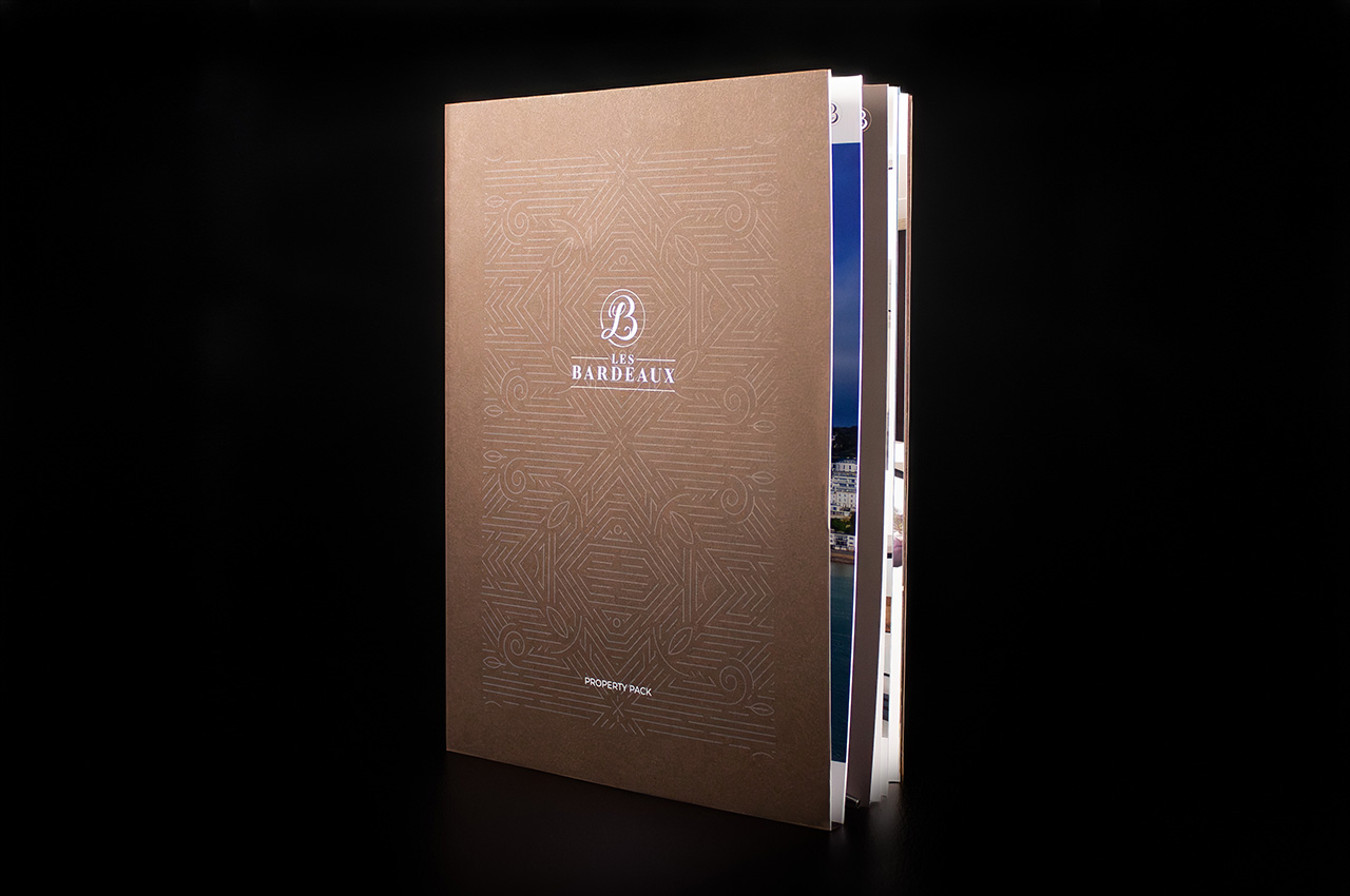
Created for Les Bardeaux, this piece was designed to go beyond a standard brochure.
It isn’t something that gets flicked through once and put down. It’s built to be used, referred back to, and kept.
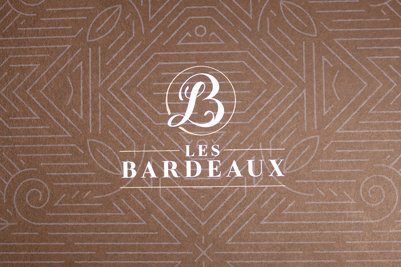
The outer cover sets the tone straight away. Colorplan in Bitter Chocolate gives it weight and presence, while the foiled detailing introduces just enough contrast to lift the design without overcomplicating it.
It feels considered before it’s even opened.
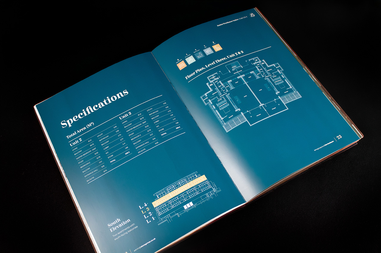
Inside, the structure does the heavy lifting.
A hand taped die cut pocket on the inside back cover transforms the piece from something static into something practical. Plans, inserts and additional information can be held neatly in place, turning it into a working document rather than just a brochure.
That’s where this piece separates itself.
It’s not just about how it looks on a table. It’s about how it performs when someone actually uses it day to day.
Because when print is designed properly, it doesn’t just present information. It organises it, supports it, and adds value long after the first read.
