
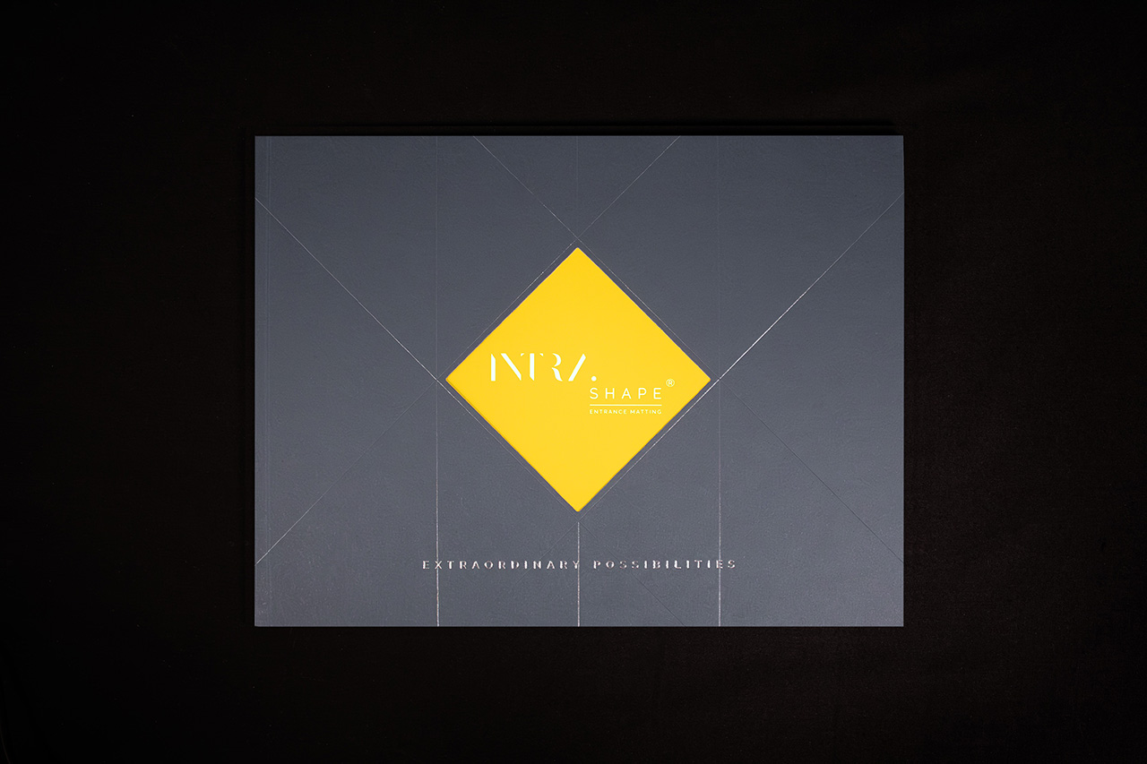
Created for Intra Shape, this brochure was designed around interaction and controlled reveal.
The cover does the work immediately.
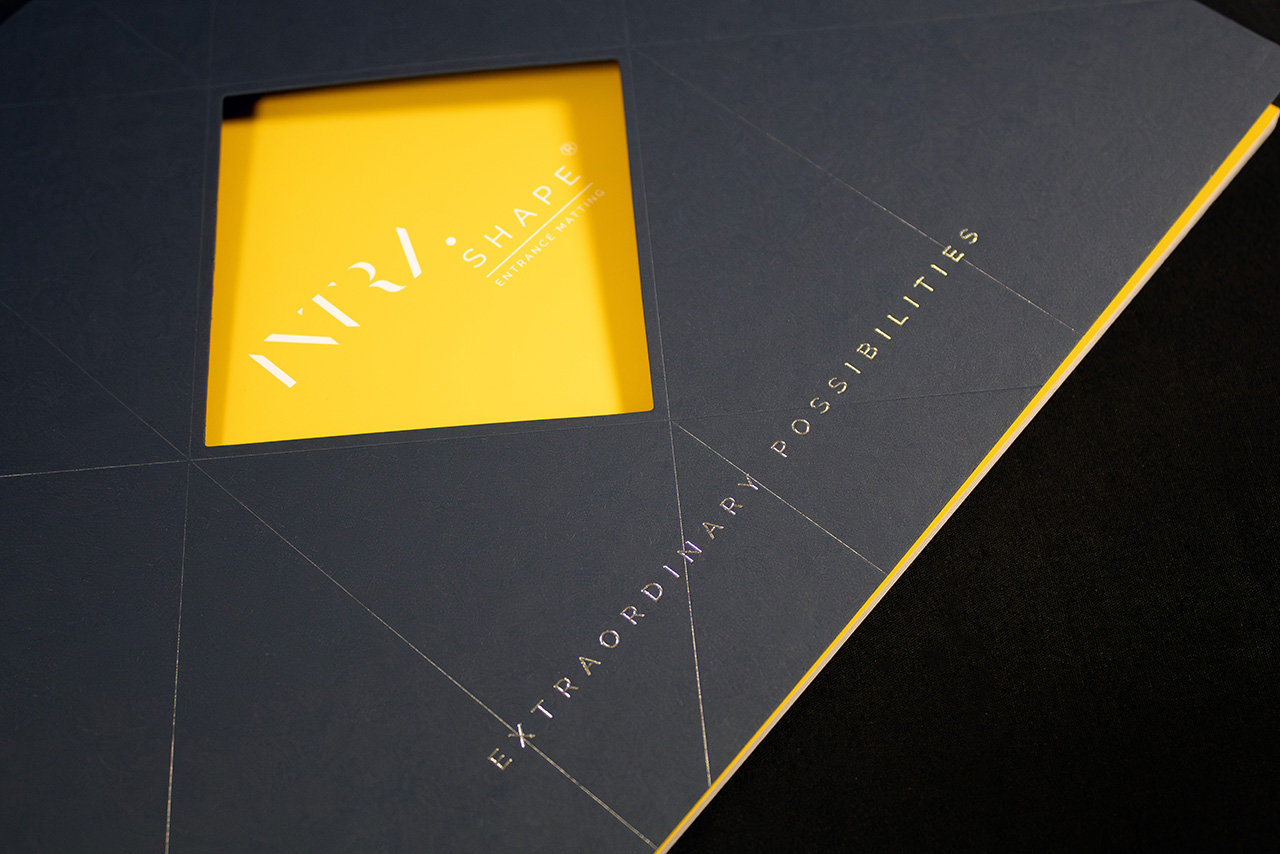
Rather than relying purely on print, the front uses a die cut aperture to create intrigue before the brochure is even opened. It gives just enough visibility of the layer beneath to encourage someone to pick it up and explore further.
That sense of reveal is intentional.
The cover stock itself is left unprinted, allowing the depth and richness of Colorplan Imperial Blue to become part of the design rather than simply a background for graphics. It gives the piece a more tactile and material-led feel from the outset.
Foil detailing adds contrast carefully rather than aggressively.
Silver foil introduces sharp highlights against the dark blue stock, while gloss clear foil creates a second layer of detail that only becomes visible as light moves across the surface. Some elements appear immediately, others reveal themselves more gradually through movement and handling.
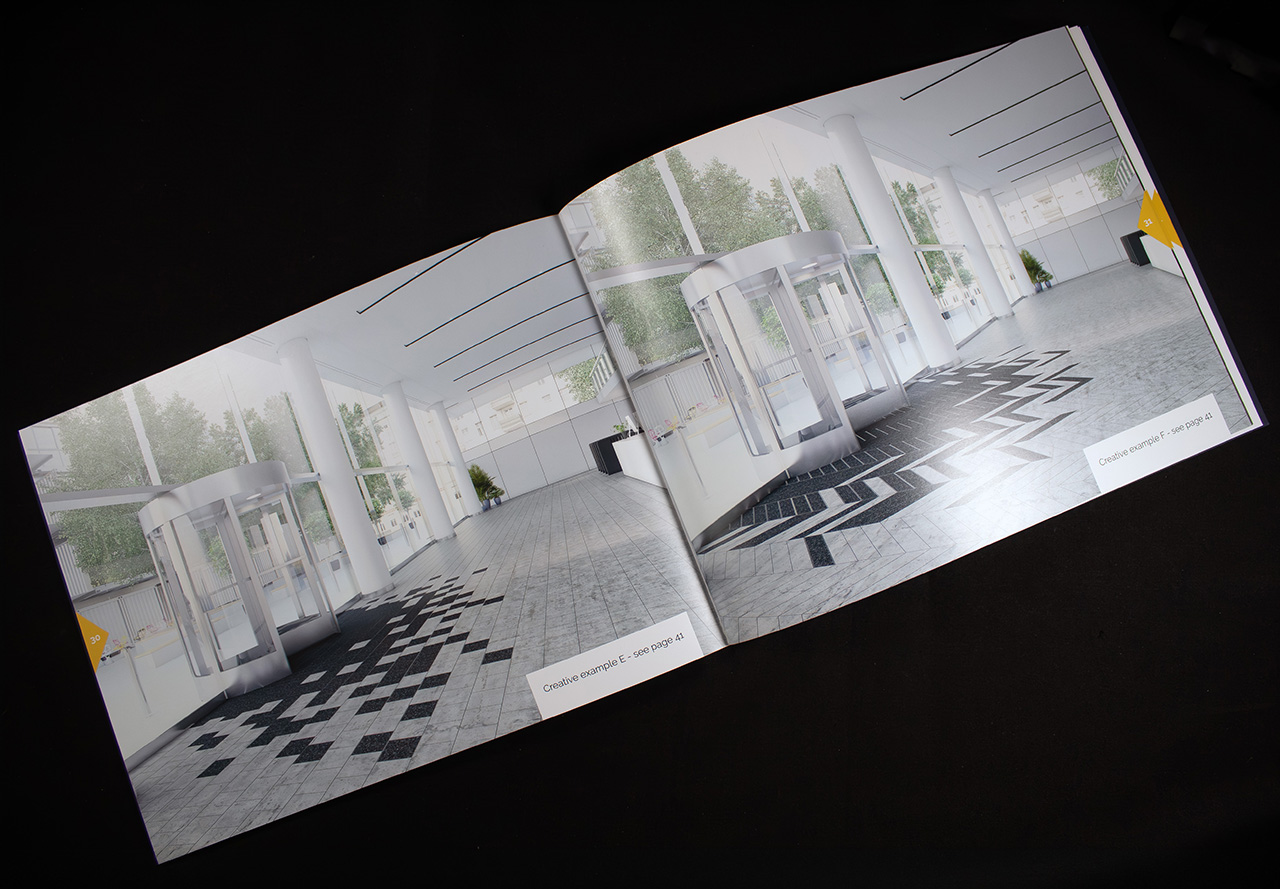
Inside, the approach becomes cleaner and more open.
The internal pages are produced on 170gsm Essential Silk, giving imagery and colour strong clarity while maintaining a smooth, refined feel throughout the brochure.
The structure reinforces the overall quality.
PUR binding gives the piece a more solid and durable finish, helping it feel substantial in hand while allowing the pages to sit cleanly and consistently over time.
The result is a brochure that balances boldness with restraint.
It uses shape, material and finish to create engagement naturally, rather than relying on excessive graphics or overcomplicated effects.
