
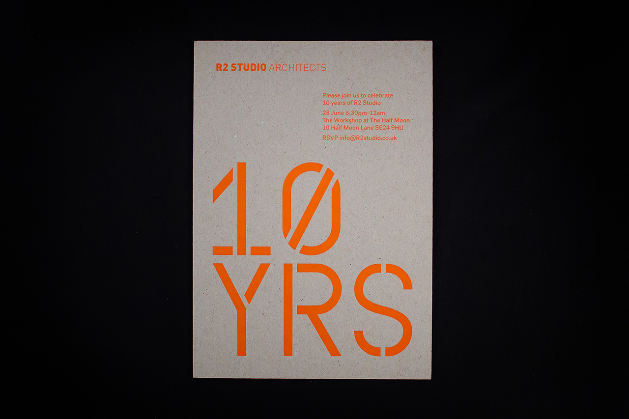
Created for R2 Studio, this invitation piece is built around a single idea executed with confidence and restraint.
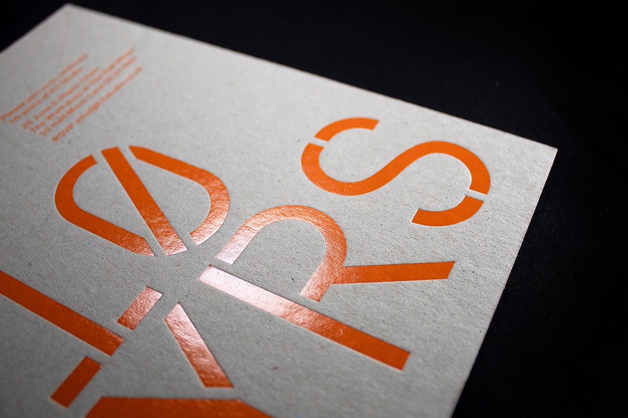
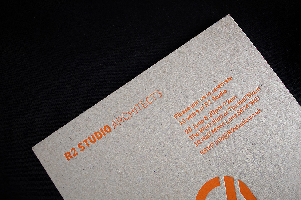
There’s no unnecessary layering, no complex construction and no attempt to overpower the design with multiple finishes. Instead, the entire piece relies on one carefully controlled contrast. High gloss neon foil against a raw grey board surface.
That tension is what gives the invitation its impact.
The uncoated grey board brings weight, texture and honesty to the piece, while the fluorescent foil introduces movement and energy as light catches across the surface. Depending on the angle, the foil shifts from solid colour into reflection, giving the invitation a constantly changing appearance without needing any additional print embellishment.
Nothing competes for attention.
The board remains deliberately unprinted, allowing the material itself to become part of the design language. The result feels bold without becoming loud, proving how effective minimal execution can be when every detail is intentional.
The heavier board stock also changes the way the piece is handled.
Rather than behaving like a conventional invitation, it feels more like an object. Rigid, tactile and substantial enough to create presence before the message is even read.
That’s what makes the project work so well.
It understands that simplicity only feels premium when the materials, finishing and restraint are handled properly.
Because once everything unnecessary is removed, every remaining detail matters more.
