
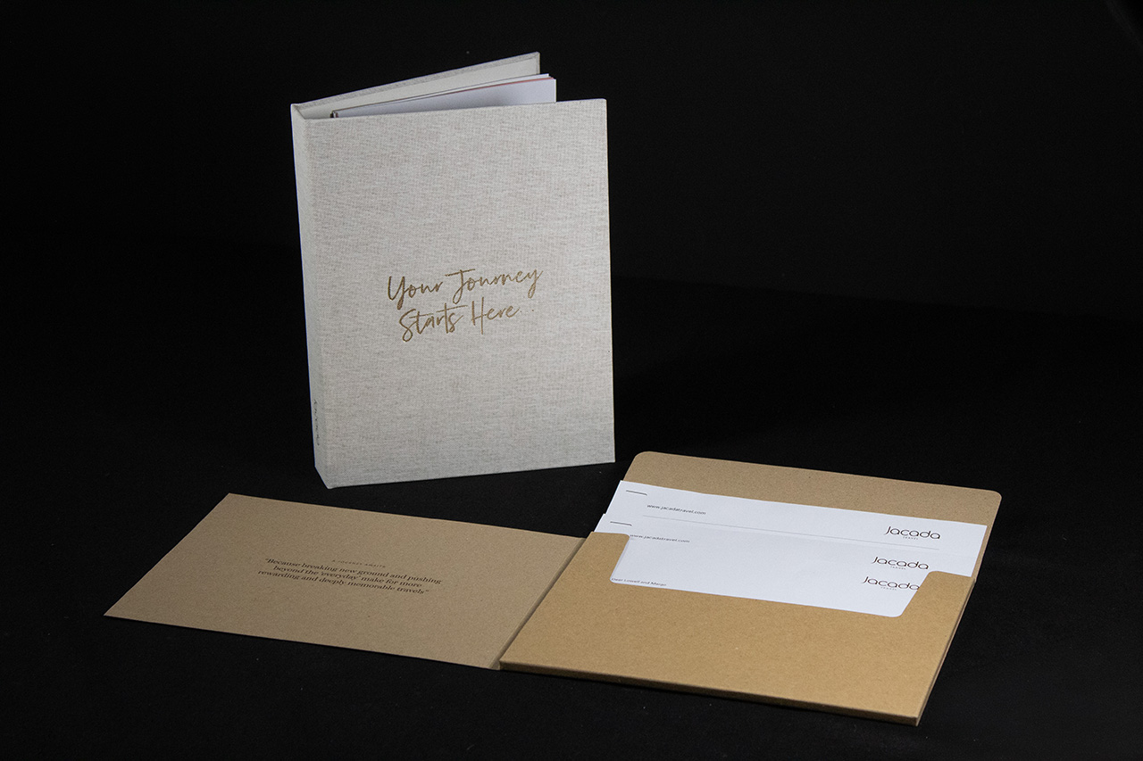
Created for Jacada, this piece is designed as a complete presentation system.
It’s not just holding information, it’s shaping how that information is introduced.
The outer cover sets the tone straight away.
Cloth wrapped and understated, it feels more like a book than a folder. That shift in perception matters. It slows the interaction down and makes the contents feel more considered from the outset.
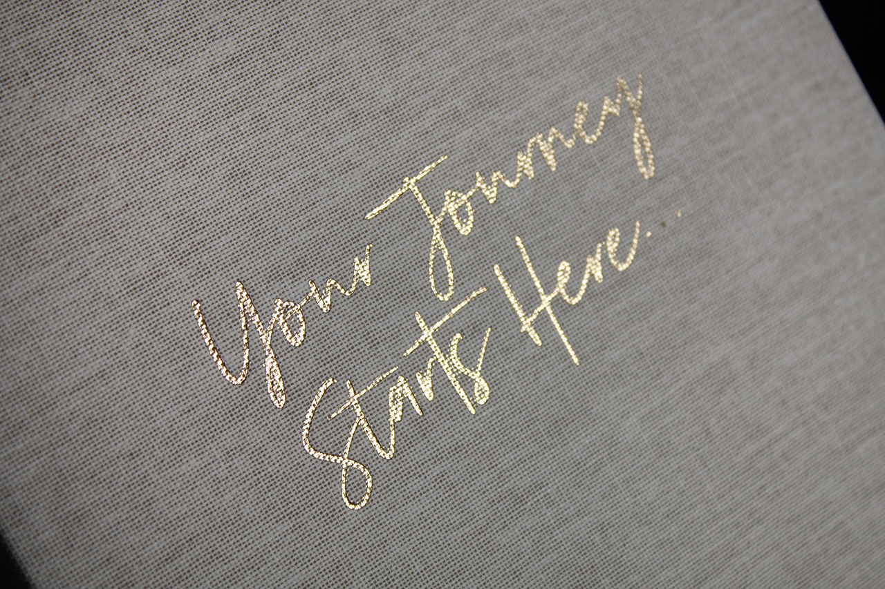
The foil detail adds just enough contrast.
Applied in gold, the script sits lightly on the surface, catching the light without dominating the cover. It’s subtle, but it signals quality immediately.
Open it up and the structure takes over.
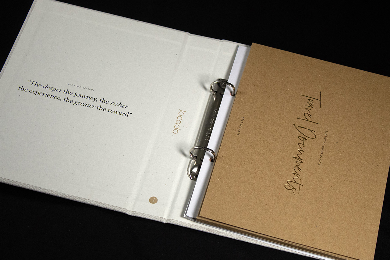
The ring binder mechanism allows the contents to be updated and expanded, which is key for something like this. It turns the piece from a one-off into something that can evolve over time.
Inside, everything has a place.
The document set, pockets and inserts are all aligned and contained, so nothing feels loose or temporary. It’s controlled, but still flexible.
Material contrast plays a role as well.
The kraft inner documents sit against the lighter outer cover, creating a clear distinction between presentation and content. It keeps the structure easy to navigate without overdesigning it.
Even the additional elements are considered.
The envelope and supporting pieces carry the same tone, so the whole set feels consistent from first touch to final page.
It’s a piece built around longevity.
Not just in how it’s made, but in how it’s used.
