

Created for The Ritz Carlton Residences, this piece is designed to do more than present information.
It’s there to set a tone.
At this level, the expectation is already high. The print has to meet that before anything is read, just through scale, weight and finish.
The format does a lot of that work.
At 250mm x 346mm, it immediately feels more considered than a standard brochure. It sits somewhere between a brochure and a presentation book, which changes how it’s handled and how long it’s kept.
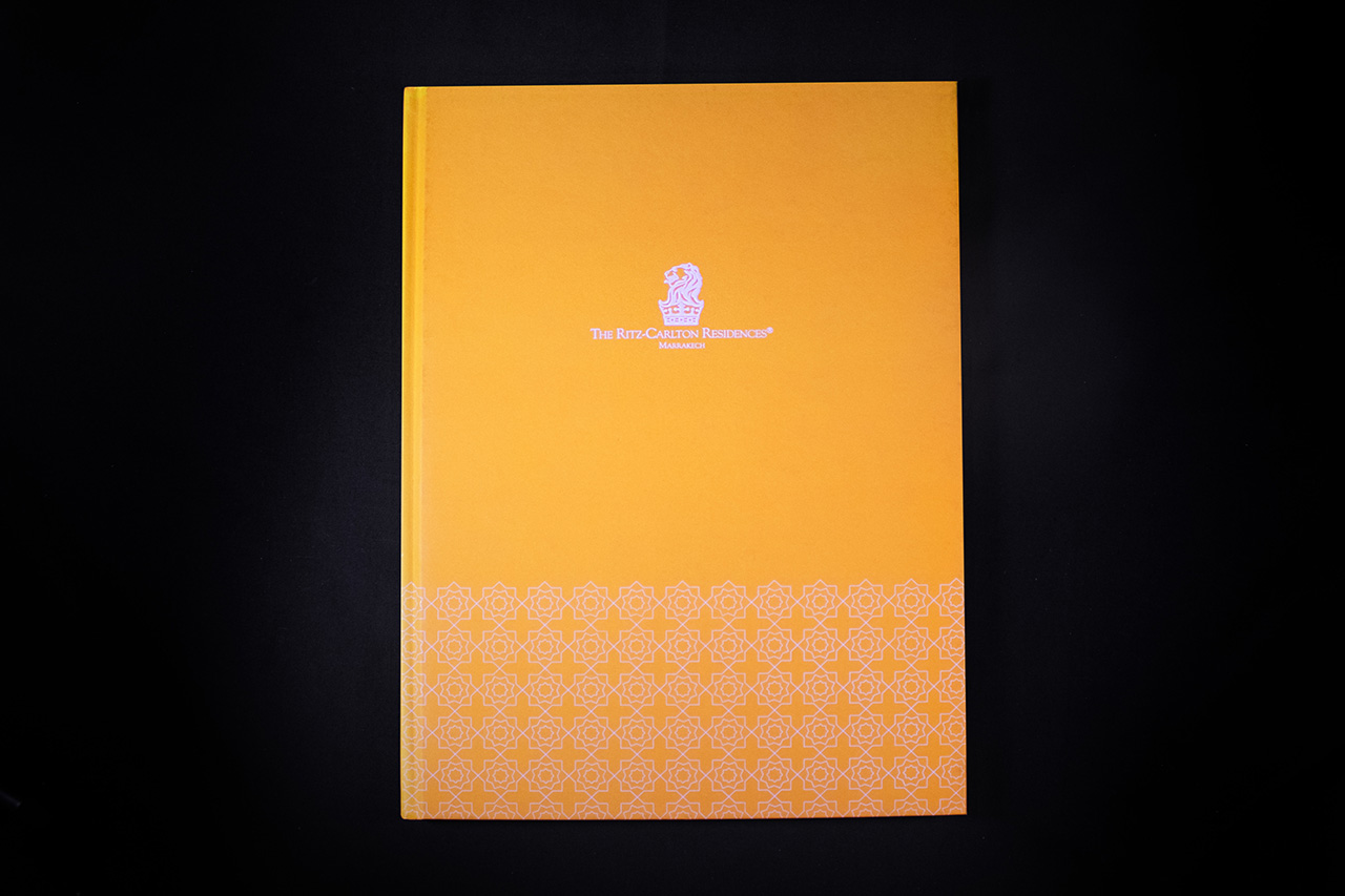
The cover is deliberately restrained.
No overcomplication, no unnecessary effects. The focus is on material and finish doing the work, giving it a quieter, more confident feel that fits the brand.
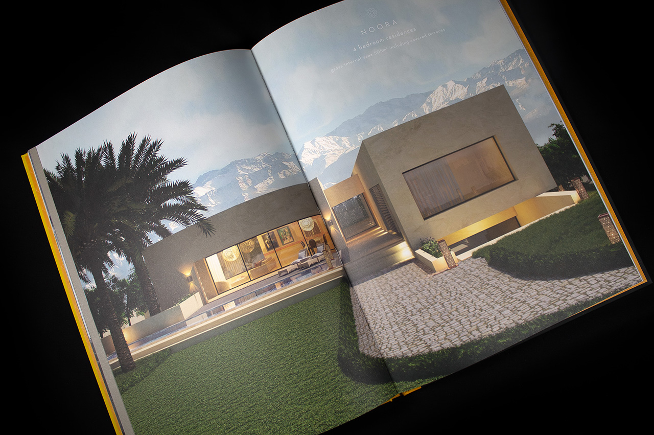
Inside, the layout is clean and consistent.
Large imagery, controlled spacing, and a structure that lets the content breathe. Nothing feels forced or overdesigned, which is exactly what you want for a piece like this.
The print quality carries a lot of responsibility here.
Large format imagery leaves no room for error, so consistency and colour accuracy are key. Everything needs to feel sharp, balanced and true to the original visuals.
Binding plays its part as well.
This isn’t something that’s flicked through once and discarded. It needs to hold together, feel solid in hand, and maintain that quality over time.
Overall, it’s a piece that relies on restraint.
Good materials, considered scale, and controlled finishing rather than trying to do too much. That’s what keeps it aligned with the level of brand it represents.
