
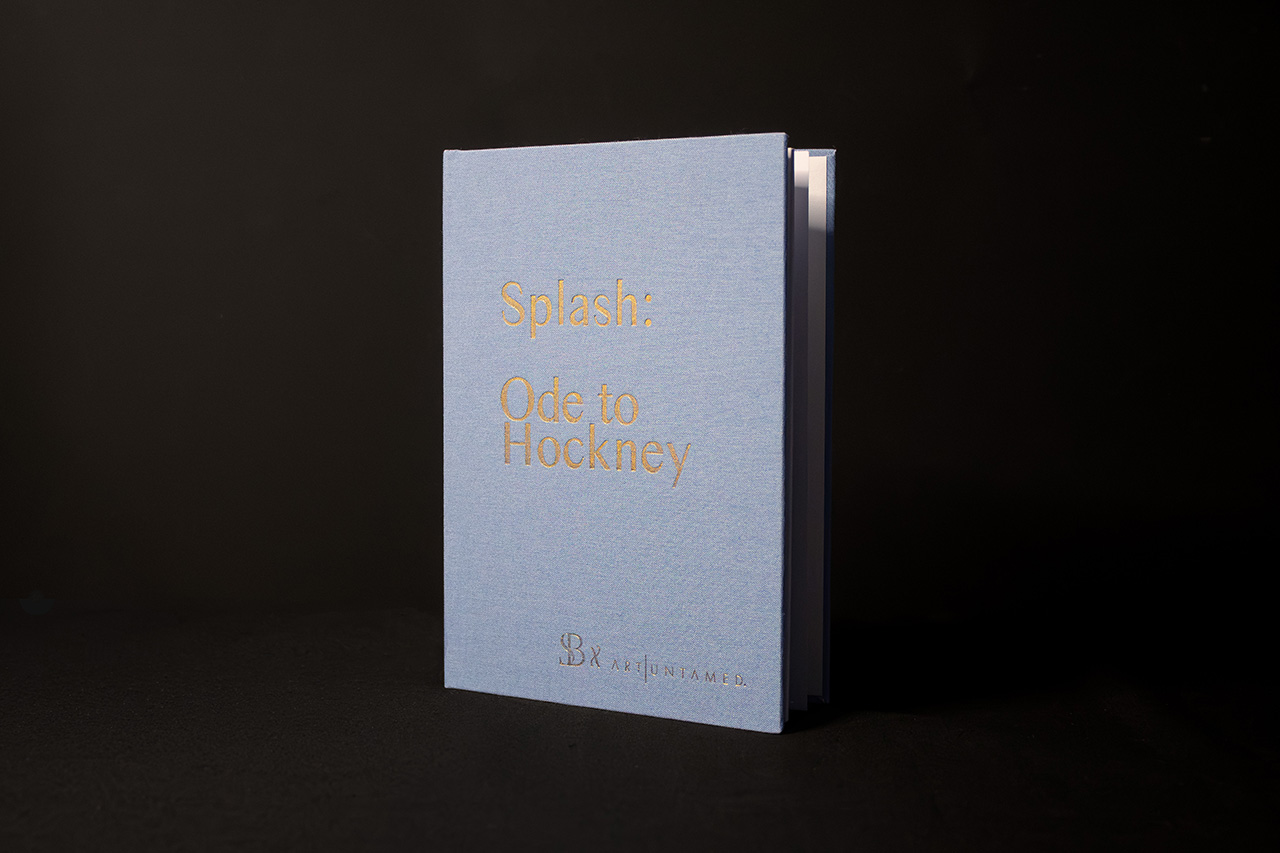
Created for Splash: Ode to Hockney, this piece is all about restraint and material.
There’s no need to overcomplicate it. The impact comes from how it feels before it’s even opened.
The cloth bound cover sets the tone straight away.
It softens the whole piece, giving it a more tactile, considered feel that suits the subject. It’s not glossy or attention seeking, it’s quieter, more confident.
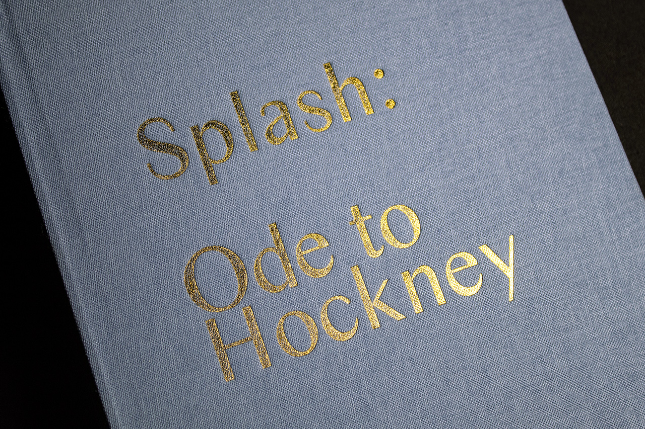
The foil blocking does the rest.
Set in gold, it lifts just enough from the surface to catch the light without overpowering the cover. It adds contrast, but keeps everything balanced.
Typography is kept simple.
There’s plenty of space around it, which gives the cover room to breathe. Nothing feels crowded or forced, which is exactly what you want for something referencing an artist like Hockney.
The construction supports that same approach.
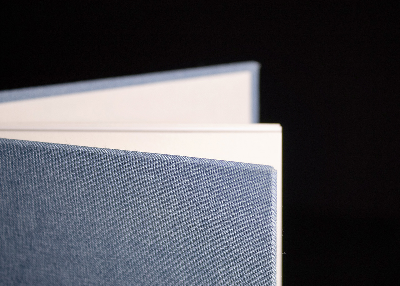
Case binding gives the book weight and permanence. It feels like something to keep, not something temporary.
Inside, the pages sit clean and even.
The thickness of the text block adds to the overall presence, reinforcing that sense of quality without needing to rely on additional finishes.
It’s a good example of doing less, properly.
Material, colour and finish all working together without competing for attention.
