
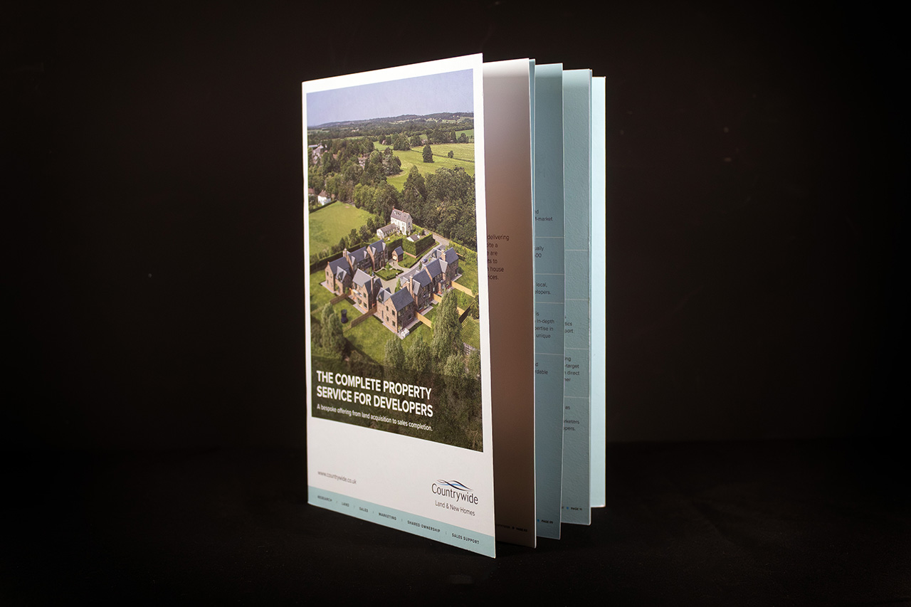
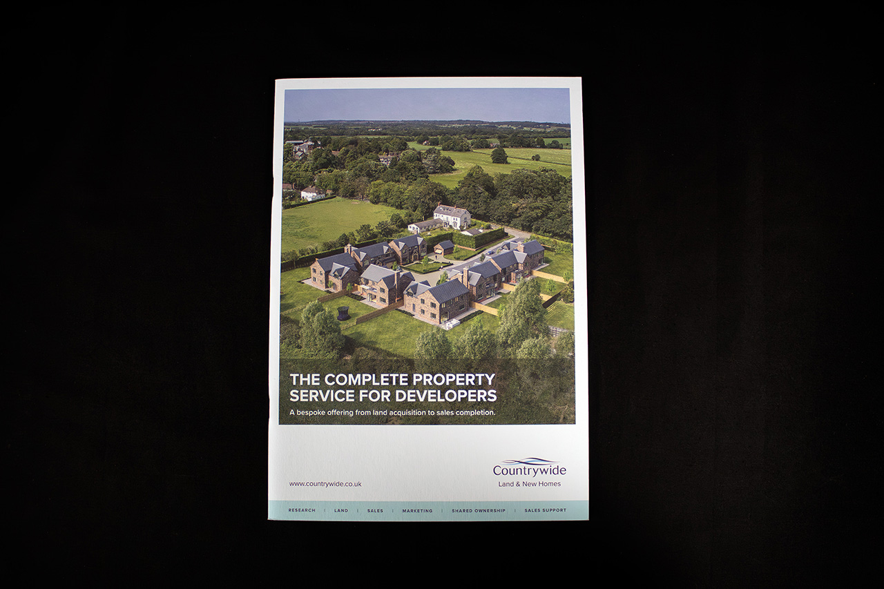
Created for Countrywide Land & New Homes, this piece is built to support developers from first impression through to active sales conversations.
It’s not trying to impress in a loud way. It’s designed to feel organised, considered and easy to work through, which is exactly what’s needed when you’re presenting developments, plans and detailed information.
Printed on Colorplan using Indigo, it has a clean, consistent finish that keeps everything sharp without distracting from the content. The design does the heavy lifting, and the print supports it rather than competing with it.
The format is deliberately straightforward.
Square back saddle stitched, it gives the piece more presence than a standard brochure, sitting somewhere between a simple handout and a more substantial document. It feels like something worth keeping, not something to flick through once and discard.
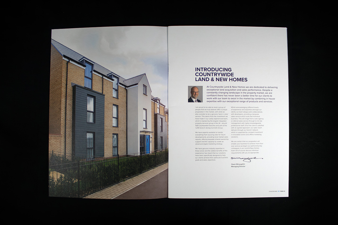
Inside, the layout is doing a lot of work.
It handles a mix of photography, floor plans and technical information without becoming cluttered. That’s harder than it looks, and it’s where a lot of property brochures fall down.
There’s also a practical layer to it.
A pocket and business card insert on the inside back cover turns it into something usable in meetings, not just something that looks good on a table.
This is a sales tool as much as a brochure.
