

Created as a limited edition publication, Red Book of Moths demonstrates how material choice and restraint can create something quietly powerful.
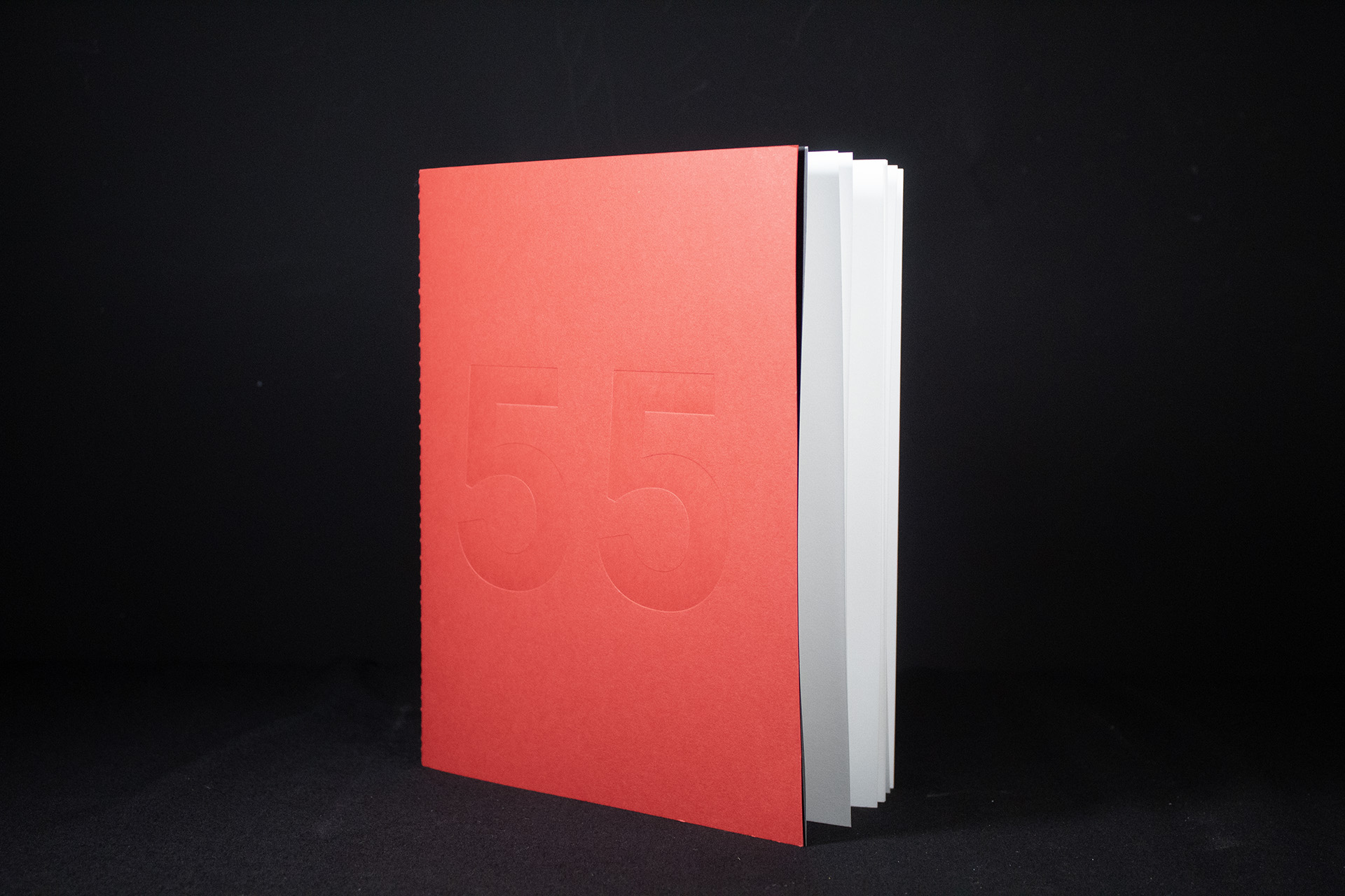
At first glance, the cover appears almost empty.
Produced on Bright Red Colorplan, the only detail is a large blind debossed “55” pressed deep into the surface. There’s no foil, no ink and no decoration competing for attention. Instead, the impression relies entirely on shadow, texture and craftsmanship, revealing itself gradually as light moves across the cover.
That sense of restraint continues throughout the piece.
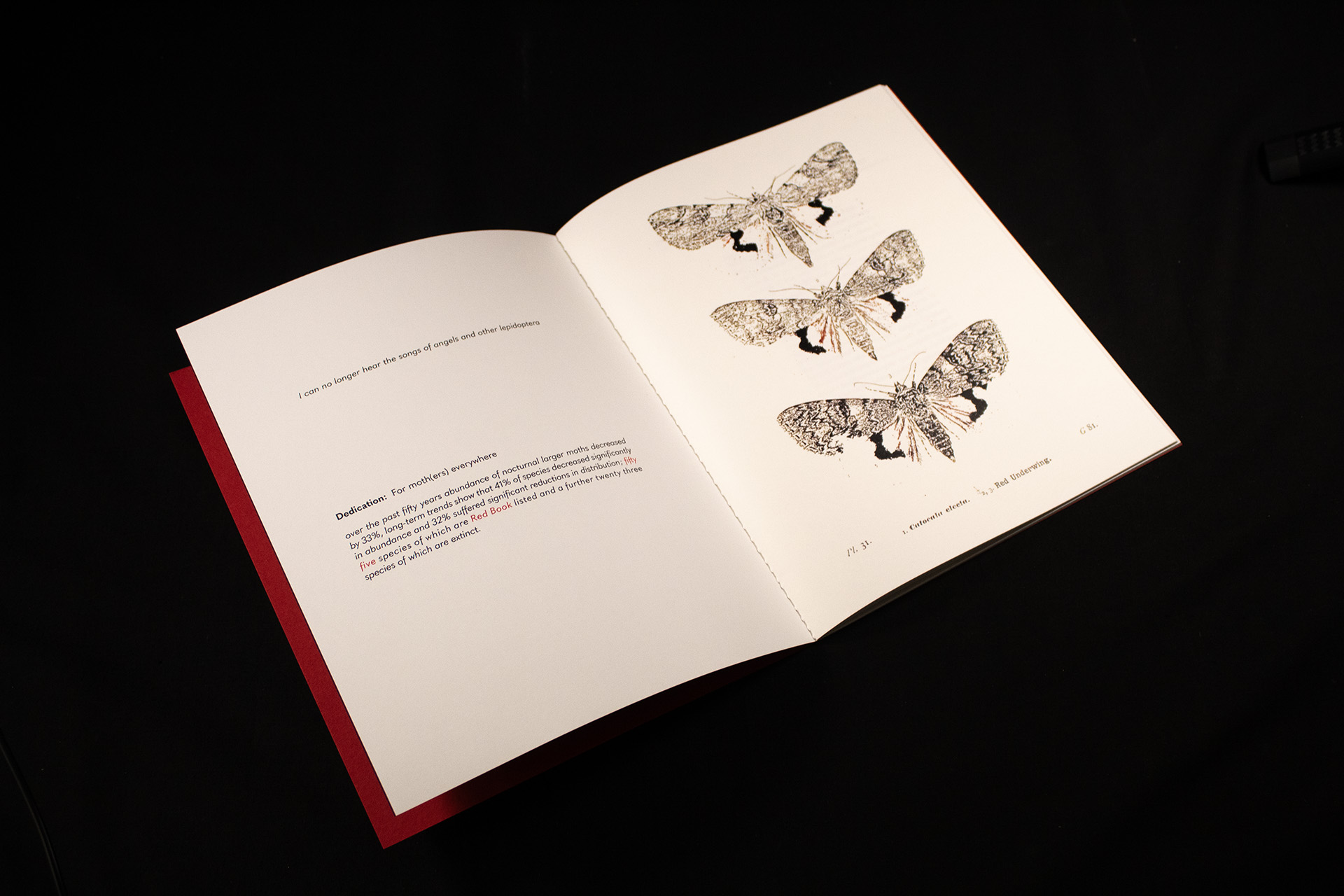
Opening the publication reveals rich black endpapers printed with both white ink and full colour process. The contrast between the vibrant red cover and deep ebony interior creates an immediate shift in atmosphere, drawing the reader into the content before a single page has been turned.
The internal pages are produced on Mohawk Superfine Smooth, a stock chosen for its exceptional print reproduction and tactile quality. Detailed moth illustrations and delicate typography sit comfortably on the uncoated surface, allowing every image to retain its character without feeling overly polished or clinical.
The binding is equally considered.
Rather than hiding the construction, the publication is singer sewn with black thread, creating a visible spine detail that feels honest and crafted. The exposed stitching becomes part of the design language, reinforcing the publication’s independent and collectable feel.
Every element serves a purpose.
The blind debossed cover, exposed sewing, tactile papers and carefully balanced colour palette work together to create a publication that feels more like an artefact than a conventional printed book.
