
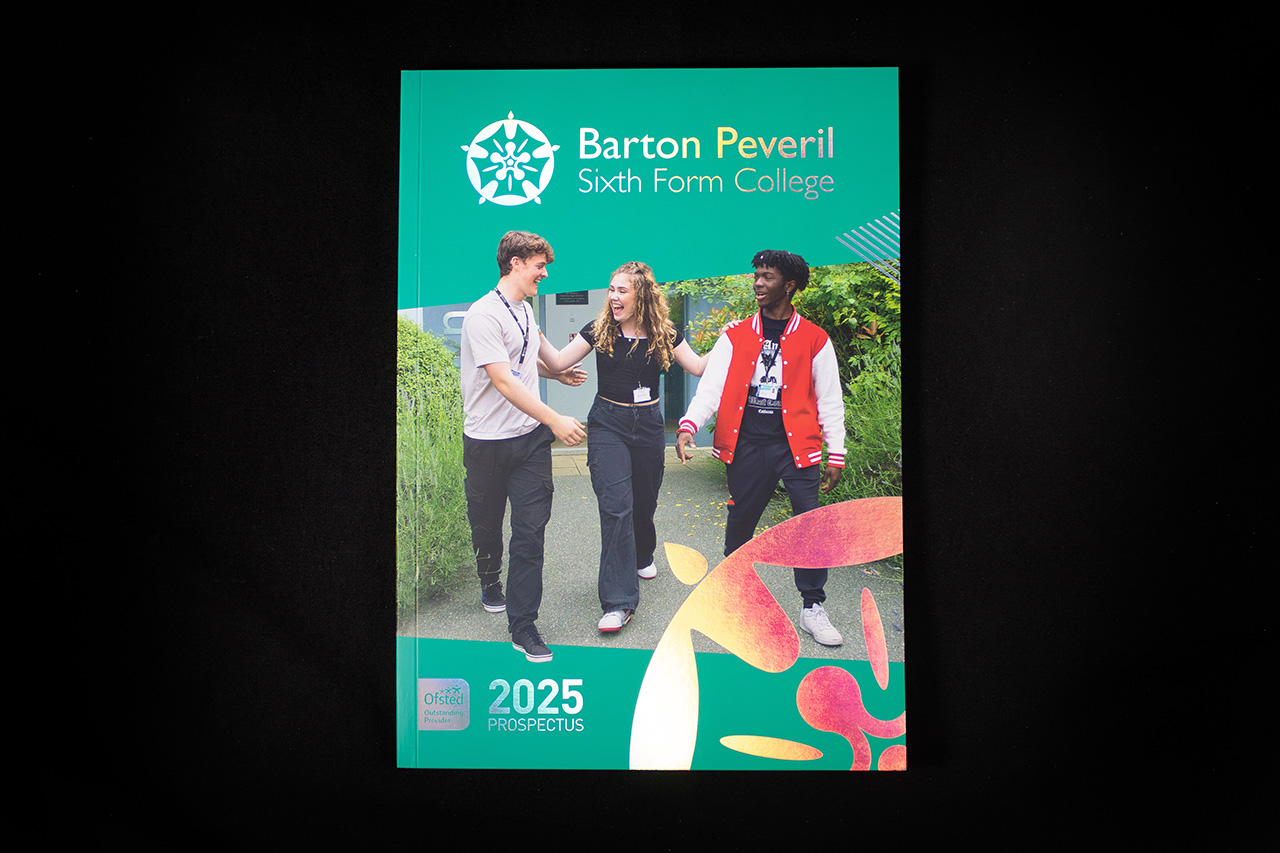
Created for Barton Peveril Sixth Form College, this prospectus was designed to feel energetic, modern and optimistic from the very first interaction.
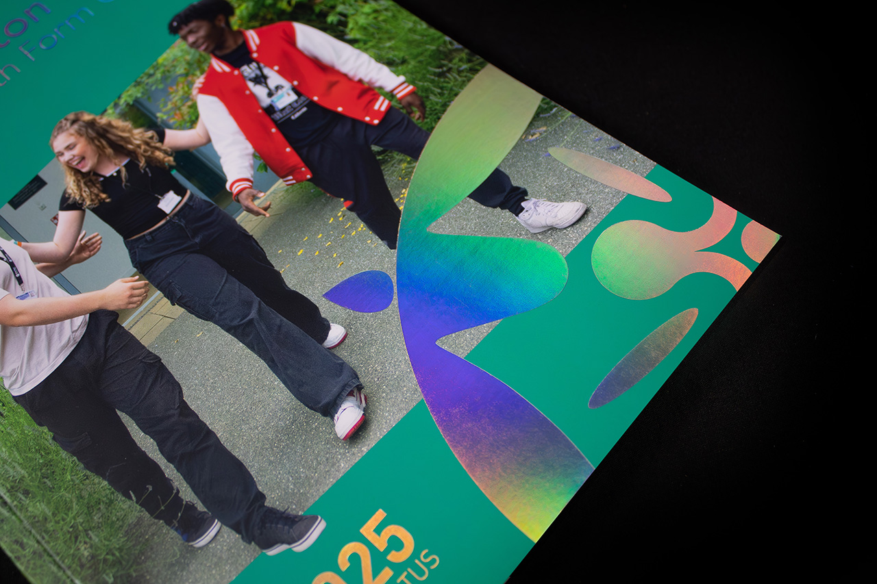
The holographic foil immediately sets the tone.
As light moves across the cover, the foil shifts through a spectrum of colour, creating movement and contrast against the vibrant green background. It gives the piece a sense of energy that reflects both the college environment and the creative ambition behind the brand.
But the finish only works because the structure around it stays controlled.
The typography is clean, the layout is open, and the imagery feels natural rather than over-directed. That balance is important. Too much visual noise and the foil becomes gimmicky. Here, it feels integrated into the identity rather than added afterwards.
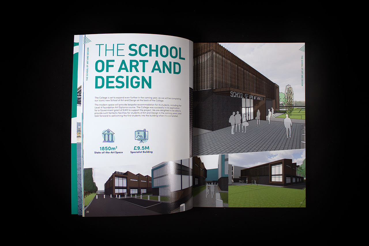
Inside, the focus shifts towards clarity and engagement.
Large imagery, bold typography and well-paced layouts help the prospectus feel approachable despite its size. At 120 pages, structure becomes critical. Information needs to feel easy to navigate, otherwise the piece quickly becomes overwhelming.
The stock choice supports that experience throughout.
A satin finish keeps photography vibrant while maintaining enough softness to avoid glare or harsh reflection under normal lighting. It gives the pages a cleaner, more premium feel while still remaining practical for a high-volume education prospectus.
PUR binding brings everything together.
Despite the page count, the book feels controlled and durable in the hand, allowing spreads to sit comfortably while maintaining a refined square-backed finish.
That combination is what makes the piece work.
Strong branding, controlled finishing and clear communication, all working together to create something that feels aspirational without losing accessibility.
