
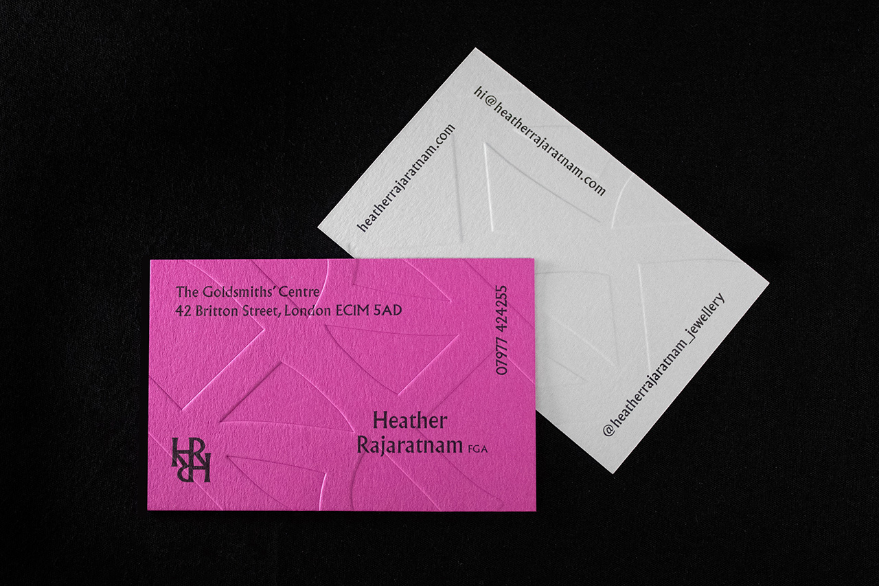
Created for Heather Rajaratnam Jewellery, these business cards are built around texture.
At a glance, they’re simple.
Minimal typography, clean layout, nothing overcomplicated. But the surface tells a different story.
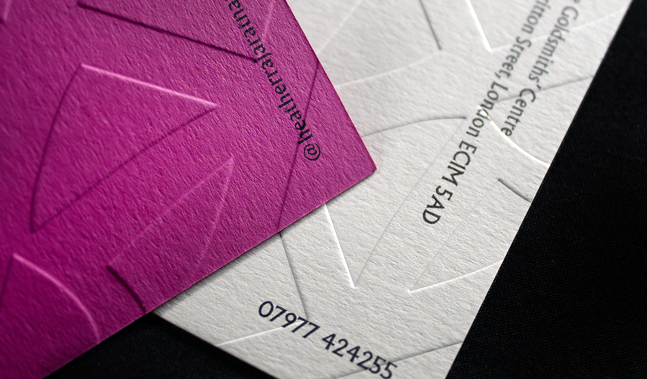
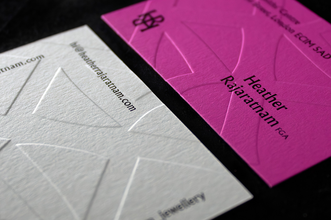
The deboss pattern runs across the entire card.
It isn’t just a small detail or a logo treatment, it’s the defining feature. Pressed deep into the stock, it creates a subtle relief that catches light differently as the card moves.
That’s what gives it presence.
You don’t just see it, you feel it.
The choice of stock plays a big role in that.
A heavily textured, uncoated paper enhances the deboss, giving it more depth and variation across the surface. It adds a natural tactility that suits the jewellery brand without needing additional finishes.
Colour is used to create contrast between versions.
The white card keeps everything understated and refined. The pink version pushes further, creating a more immediate visual impact while keeping the same structure and finish.
Typography is deliberately minimal.
Set in black, it sits quietly on top of the surface rather than competing with it. The focus stays on the material and the impression rather than the print.
It’s a piece that relies on restraint.
No foil, no gloss, no excess. Just pressure, material and control.
That’s what makes it feel considered.
